by admin | Aug 16, 2015 |
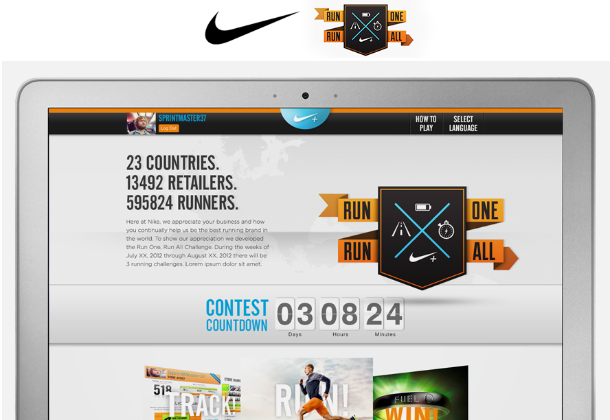
23 COUNTRIES, 14,000 RETAILERS, 60,000 RUNNERS AND ONE, BIG GOAL Proving that a little competition can bring teams together and produce huge results TIME TO REENERGIZE Nike Europe approached the Bravas team with a unique challenge. Nike Corporate had recently launched a series of updates to its Nike+ products including an updated version of the Nike Fuel Band. And while consumer awareness was high, their retail store associates were not educated or excited about the products. A BIG IDEA IS BORN But our ideas and solutions were bigger than product education; we wanted to reenergize the teams and ignite collaboration. We discovered through research that store associates learned best through actual product trial as opposed to “boxed” trainings or store incentives. That’s when “Run One. Run All.” was born. MORE THAN JUST A RUN Run One Run All was an experiential web and in-store experience that generated healthy competition amongst retail associates, stores and even countries. We tapped the Nike+ API and created a 3-week long contest. Each week focused on an aspect of running (distance, speed, duration). Participating employees could track their runs and to see both employee and storewide results. A HOLISTIC APPROACH Bravas developed the holistic campaign strategy. In addition to the responsive web application and its game mechanics, we also created the campaign’s supporting materials. Everything from the identity, in-store POS, marketing and email communications down to the prizes and awards for the participating retail employees and the stores. AND THE WINNER IS… The effort was considered wildly successful and is still used today to help shape the way products and incentives get introduced to...
by admin | Aug 15, 2015 |
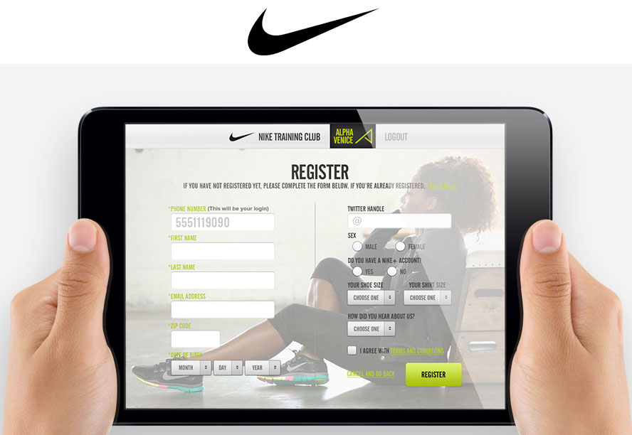
HELPING NIKE NTC TRACK CHECK-INS AND PARTICIPATION Because of the transient nature of the NTC business model, the Bravas team decided to build a responsive web app delivered on iPads. However, we knew that success did not lie only in the device and app itself. First, we spent several days in several locations observing club-goers. We watched which doors they most commonly used and where their eyes were focused upon entering. Were they holding anything in their hands? We also took note of whether these patterns changed at different times of the day. After comparing notes, we concluded that the strategic placement of the iPads would be a critical success factor. And, because most club-goers were carrying multiple items in their hands and on their shoulders, the UI would need to accommodate a one-handed user. Most importantly, the solution could not disrupt the club-goer’s main purpose – check in, work out, get out. By minimizing the amount of information required to sign-up and sign-in, coupled with the simple, tappable interface, we created a solution that worked. The real gem however, was the open source CMS we designed for Nike. With a multi-level permissions architecture, NTC trainers could search, filter and sort to track how often, when, where and who was attending their classes. It also offered tools to reward their trainee’s good attendance or encourage those who may need a push. The robust back-end generated reports that could be easily shared and saved, and then exported to Nike’s central CRM database with a tap of a button. The application not only exceeded all the core business objectives, Nike adapted...
by admin | Aug 13, 2015 |
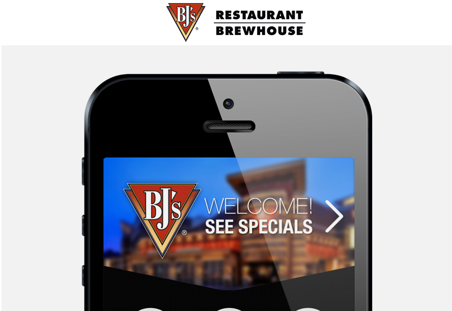
Designing a better online ordering system for a growing restaurant chain KEY HIGHLIGHTS BJ’s engaged the Bravas team to design a completely custom and responsive application for placing online takeout and dine-in orders. The goal was to replace their existing, out-of-the-box software. After a 4-day immersion into their business, processes and systems, we established that the solution would integrate with several databases and multiple proprietary software packages that they used in their kitchen, hostess, and takeout areas. Once we became grounded in their technical infrastructure, we studied their analytics, audience data and menus. Next, we collaborated with the BJ’s IT and Marketing teams to design a mobile-first interface that would seamlessly handle the endless menu options offered to their take-out customers. Our efforts resulted in an intuitive, fully responsive web application and reconfiguration of the menu flow that simplified ordering, and improved their checkout process. KEY TAKEAWAYS The new application was rolled out to 12 pilot restaurants so we could test, learn and improve the application before rolling it out to all of their locations. The solution made an immediate impact and significantly increased conversion and loyalty program sign-ups. Related Case Studies Wilson Custom Gloves CMS, Mobile, Product Customizer, Responsive, SEO, Usability Testing Demarini Custom Bats CMS, Mobile, Product Customizer, Responsive, SEO, Usability Testing Brunswick Billiards CMS, Ecommerce, Interaction Design, Responsive, UI Design Nike RORA Mobile, POS, Rapid Prototyping, Responsive, UX...