BJ’S Restaurant

BJ’S Restaurant

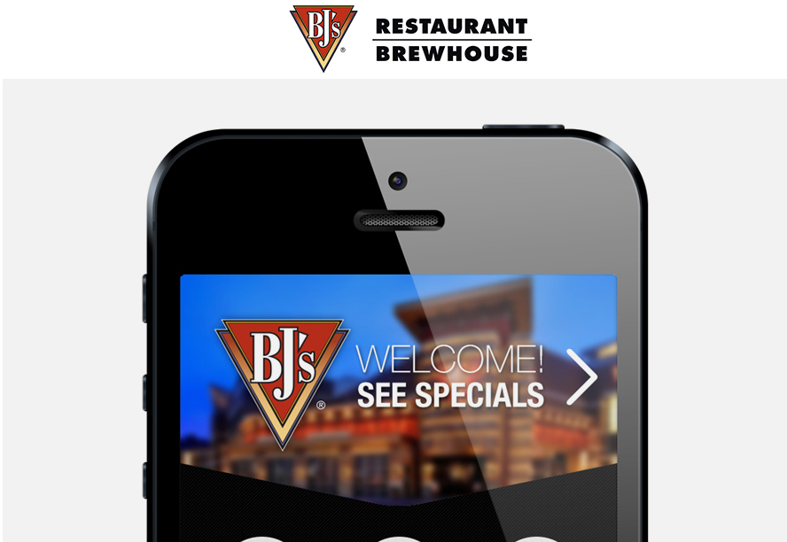
Designing a better online ordering system for a growing restaurant chain KEY HIGHLIGHTS BJ’s engaged the Bravas team to design a completely custom and responsive application for placing online takeout and dine-in orders. The goal was to replace their existing, out-of-the-box software. After a 4-day immersion into their business, processes and systems, we established that the solution would integrate with several databases and multiple proprietary software packages that they used in their kitchen, hostess, and takeout areas. Once we became grounded in their technical infrastructure, we studied their analytics, audience data and menus. Next, we collaborated with the BJ’s IT and Marketing teams to design a mobile-first interface that would seamlessly handle the endless menu options offered to their take-out customers. Our efforts resulted in an intuitive, fully responsive web application and reconfiguration of the menu flow that simplified ordering, and improved their checkout process. KEY TAKEAWAYS The new application was rolled out to 12 pilot restaurants so we could test, learn and improve the application before rolling it out to all of their locations. The solution made an immediate impact and significantly increased conversion and loyalty program sign-ups. Related Case Studies Nike NTC CMS, Interaction Design, Mobile, Rapid Prototyping, Usability Testing, UX Strategy Gillette Interaction Design, Mobile, Responsive, UI Design, Usability Testing, UX Strategy BJ’S Restaurant CMS, Custom Reporting, Ecommerce, Rapid Prototyping, Responsive, UI Design Nickelodeon Interaction Design, Mobile, Responsive, UI Design, Usability Testing, UX...
Nickelodeon

Nickelodeon

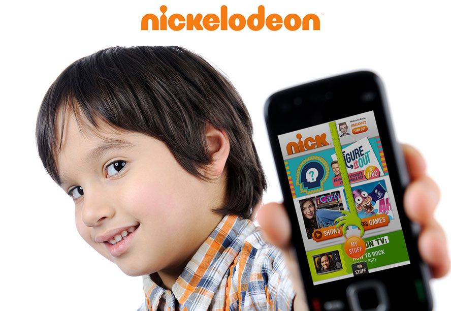
GETTING INTO THE HEADS – AND HANDS – OF KIDS OUT OF THE MOUTHS OF BABES Kids don’t understand the differences between a mobile app and a mobile website, but they do know what they want. And they weren’t shy about telling us. When Nickelodeon hired the Bravas Chicago team to ideate and prototype their new mobile experience, we gladly accepted, gathered a panel of 5-12 year olds and channeled our inner kids. We quickly learned that 5-8 year olds never use navigation, they tap incessantly on images that they like, period. The 9-12 year olds were smarter than us and wanted advanced features typically only found in native apps. Each day was an education, one that we savored and we will never forget. This awesome experience humbled all of us. Kids are digital natives, they’re honest to a fault and there’s no ego. We learned to account for things like small hands and fingers and to ensure that imagery will resonate with their limited exposure to the brand. Every day with them was enlightening and educational. KEY TAKEAWAYS We used rapid prototyping, developing hundreds of ideas and bringing them to our eager panel for testing and feedback. In the end – after exhaustive weeks of ideation, goldfish crackers and a few bruised egos – we all knew we had something special. Not because we thought so, but because our awesome panel told us so. Related Case Studies Nike NTC CMS, Interaction Design, Mobile, Rapid Prototyping, Usability Testing, UX Strategy Gillette Interaction Design, Mobile, Responsive, UI Design, Usability Testing, UX Strategy BJ’S Restaurant CMS, Custom Reporting, Ecommerce, Rapid Prototyping,...
Sport RX

Sport RX

CREATING A SIMPLE BUT STELLAR CX ONLINE A dose of user research and smart UX makes a complex online process, simple GREAT USER EXPERIENCE CAN TRANSFORM A BUSINESS Privately owned SportRx had quickly become the leading seller of sports and performance prescription eyewear in the nation. In addition to offering major brands such as Smith, Oakley, and SpyOptic, they provided unparalleled customer service through their on-staff ophthalmologist team. When they decided it was time to take that experience online, their first attempt failed miserably. One of the core objectives of their new site was to significantly cut down on customer service calls. The calls actually doubled when the site launched. They were stumped. No one knew their business, their product or their customer’s needs better than them, so why wasn’t anyone able to accurately order a product online? The SportRx team engaged the Bravas team to help them figure it out. For us, having a client partner with so much industry, customer and product knowledge was a dream come true. We spent 4 days on-site with their entire team learning their business and pain points. We put heat maps on their current site to identify patterns and identify issues and gaps. Within 3 days, we identified the core UX issue. Most users were bailing at the “Enter Your Prescription” step in the purchase path. And, if they were lucky enough to get through it, they bailed at the next step. Through solid UX and UI best practices and multivariate user testing to validate our proposed solutions, we reimagined their entire online experience. % decrease in customer service calls %...
Tetra Pak

Tetra Pak

A CARTON SHOULD SAVE MORE THAN IT COSTS Empowering a global packaging company to create a movement of inspired change BIG BUSINESS WITH A BIGGER MISSION Tetra Pak is so much more than a multi-billion dollar, global packaging and processing solutions company; they are also committed to greatly reducing the environmental impact of their operations. CartonSmart by Tetra Pak is a multi-faceted campaign developed to help deliver their sustainability message to U.S. consumers. WE “THINK” IT’S WORKING When the Bravas team entered the scene, the campaign was well under way. We learned that they were spending money in various social channels and PR tactics trying to generate a groundswell for CartonSmart. And, while they “felt” that the campaign was doing well, they had no concrete way to know for sure. That’s why they called on us. GROUP HUGS ALL AROUND We first arranged and led meetings with the various campaign teams. Interviews, breakouts and surveys revealed that everyone truly believed in the cause, but the campaign lacked unified, actionable requirements. We also uncovered a lot of redundancy and overlap between teams. PULL IT TOGETHER, MAN Our solution was a CartonSmart “Hub”, a responsive web application that tapped all of the social media APIs and aggregated the feeds into one, flexible and modular UI. For the channels and tactics without an API, we created a custom CMS allowing the brand and some chosen manufacturers to easily manage that content too. For streamlining, we developed a social keyword and hashtag strategy to be used across all campaign teams. Within two weeks, the Hub was seamlessly pulling together the entire campaign. Now,...